STYLESCAPE
What have I done?
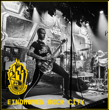
To get started with the branding of Eindhoven Rockcity we made stylescapes. I first tried doing this in InDesign however this was taking too much time for me to complete before the deadline discussed with the group and I couldn't get the results I wanted so I did end up switching to Figma so that I was able to finish a good stylescape. I then got feedback on the stylescape I made and based on that I added an accent color and some more explenation of what kind of feelings I wanted to convey with the different parts of the stylescape and what they were going to be used for. The accent color I went for here was a light purple with greyish undertone since this contrasted well with the yellow and also looked good and readible in combination with both a black and a white background.
What have I learned?
- Information which is important to include in the stylescape such as fonts, colors, type of images, tone of voice and what you want your audience to feel with your brand.